How to Optimize Your Website Images With WebP (2026)
Your phone camera takes photos that are 5-6 MB each. If you upload those directly to your website, your homepage can force visitors to download 30 MB before they see anything useful. You need to optimize those files for the web.
According to the HTTP Archive's 2025 Web Almanac (opens in a new tab), images account for a large share of total page weight on the average website. For image-heavy business sites, it's often more. Images are almost always the biggest thing slowing your website down.
The fix isn't complicated. Resize your images, convert them to WebP, and serve the right size to each device. Here's exactly how.
Before and after image optimization: a 5.8 MB phone photo at 4032x3024px becomes a 145 KB WebP at 1920x1080px, 97% smaller, with page load dropping from 6+ seconds to under 2 seconds
Why This Matters for Your Business
Every extra megabyte your visitors download adds time to your page load. Every fraction of a second costs you money.
Research by Deloitte (opens in a new tab) found that small speed improvements improved progression through key mobile purchase-funnel steps and increased revenue outcomes.
Vodafone tested this too. A 31% improvement in their loading speed (opens in a new tab) led to 8% more sales, 15% better lead-to-visit rates, and 11% more cart activity. Their biggest change? Resizing and optimizing images.
For most websites, images are the easiest performance win. If your Core Web Vitals scores are poor, start here. The Largest Contentful Paint (LCP) metric measures how fast your main content appears. On most pages, that main element is an image.
Google wants LCP under 2.5 seconds (opens in a new tab). A 5 MB hero photo makes that hard to achieve.
Slow pages also increase your bounce rate. Visitors don't wait around. They leave and go to a competitor whose site loads faster.
What Is WebP?
WebP is an image format created by Google (opens in a new tab). It does one thing very well: smaller files without visible quality loss.
According to Google's compression study (opens in a new tab), WebP images are 25-34% smaller than equivalent JPEGs at the same visual quality, measured using SSIM (Structural Similarity Index). Compared to PNG, lossless WebP is 26% smaller (opens in a new tab).
WebP handles everything you need for the web:
- Photos: Lossy compression, like JPEG but smaller
- Transparency: Alpha channel support, like PNG
- Animation: Replaces GIF with better color depth and smaller files
- Lossless: Perfect quality preservation when you need it
Can I Use (opens in a new tab) shows broad WebP support across current Chrome, Safari, Firefox, Edge, and major mobile browsers. The only holdout is Internet Explorer, which Microsoft retired years ago.
Google lists WebP as a supported format for image search (opens in a new tab). Your WebP images appear in Google Images results the same as JPEGs and PNGs.
Resize Before You Upload
The most common mistake business owners make: uploading images straight from a camera or phone without resizing them.
A typical smartphone photo is 4000-5000 pixels wide. Your website probably displays that image at 800-1200 pixels wide. You're forcing visitors to download an image several times larger than what they actually see on screen. That wasted data adds seconds to your page load for no visible benefit.
Here are the dimensions and file sizes you should target:
| Element | Max Width | Target File Size |
|---|---|---|
| Hero/banner | 1920px | Under 200KB |
| Blog/content images | 1200px | Under 150KB |
| Thumbnails | 300-400px | Under 30KB |
| Product images | 2000px | Under 200KB |
| OG/social share | 1200 x 630px | Under 200KB |
For retina (high-density) screens, cap your images at 2x the display size. A hero image displayed at 960px on a retina screen needs a 1920px source. Going to 3x or 4x adds file size with no perceptible quality improvement.
One exception: social sharing images (OG tags). Use JPEG or PNG for these. Not all social platform crawlers support WebP yet.
Flowchart for choosing the right image format: photos use WebP lossy at quality 80, transparent images use WebP lossy at quality 85-90, logos and icons use SVG or WebP lossless
Quality Settings: The Sweet Spot
Image quality settings range from 0 to 100. Most people export at 100, thinking anything less means visible degradation. It doesn't.
The relationship between quality and file size isn't linear. Dropping from 100 to 80 typically cuts file size by 30-50% with virtually no visible difference at normal viewing sizes. Dropping from 80 to 60 saves less but quality loss becomes noticeable. Below 50, quality falls off a cliff.
Here's what to use for WebP:
- Photos: Quality 80. This is the sweet spot. You won't see the difference, but your files will be significantly smaller.
- Logos and icons: Lossless WebP. Sharp lines and flat colors blur under lossy compression.
- Transparent photo cutouts: Quality 85-90.
- Screenshots and text-heavy images: Lossless WebP or PNG.
Google's own cwebp conversion tool (opens in a new tab) defaults to quality 75. They set that default for a reason: it's the floor of the visually lossless range. Quality 80 gives you a small margin above that floor with minimal file size increase.
How to Convert Your Images to WebP
You have several options depending on how many images you're converting and how technical you want to get.
One Image at a Time
Squoosh (opens in a new tab) is an open-source, browser-based image compression tool from Google Chrome Labs. Drag an image in, choose WebP as the output, adjust the quality slider, and download. It shows a real-time side-by-side comparison so you can see exactly what quality level works.
The conversion happens entirely in your browser. Your images never leave your computer.
Batch Conversion
For converting many images at once, XnConvert (opens in a new tab) is free for personal use and works on macOS, Windows, and Linux. Drop a folder of images in, set output format to WebP at quality 80, and convert the batch.
Command Line
Google's cwebp (opens in a new tab) converts images directly from the terminal:
bashcwebp -q 80 photo.jpg -o photo.webp

# Lossless conversion for logos
cwebp -lossless logo.png -o logo.webp
Your Platform Might Handle It
Some website platforms convert images to WebP automatically:
- Shopify: Converts uploads to WebP and serves them to supported browsers
- Squarespace: Automatic background conversion to WebP
- Wix: Auto-converts to WebP and AVIF for supported browsers
- WordPress: Requires a plugin (Imagify, ShortPixel, or Converter for Media)
Even if your platform auto-converts, you still need to resize before uploading. Automatic format conversion doesn't fix oversized dimensions.
Serving the Right Image to Every Device
A visitor on a large desktop monitor doesn't need the same image as someone on a phone over a cellular connection. The HTML <picture> element (opens in a new tab) lets you serve different versions to different devices. The browser evaluates each option and downloads only one image (opens in a new tab). No wasted bandwidth.
Format Fallbacks
Serve modern formats with older formats as backup:
html<picture>
  <source srcset="hero.avif" type="image/avif">
  <source srcset="hero.webp" type="image/webp">
  <img src="hero.jpg" alt="Description of the image"
       width="1920" height="1080">
</picture>
The browser tries AVIF first, then WebP, then falls back to JPEG. Older browsers that don't understand <picture> use the <img> tag directly.
Responsive Sizing With srcset
You can serve different image sizes based on the visitor's screen width:
html<img
  srcset="hero-480.webp 480w,
          hero-800.webp 800w,
          hero-1200.webp 1200w,
          hero-1920.webp 1920w"
  sizes="(max-width: 600px) 100vw,
         (max-width: 1200px) 50vw,
         1920px"
  src="hero-1920.webp"
  alt="Description of the image"
  width="1920" height="1080">
The srcset lists your available image files with their pixel widths. The sizes attribute tells the browser how wide the image will display at different screen sizes. The browser picks the best match automatically.
A phone gets the 480px version. A desktop gets 1920px. MDN's responsive images guide (opens in a new tab) covers the full syntax.
If your website is built on a responsive framework, your developer should be implementing srcset for any image that appears at different sizes across breakpoints. If you're on Shopify, Squarespace, or Wix, the platform generates responsive versions for you through its CDN.
Loading Priority: What Loads First Matters
Not every image should load the same way. Images visible when the page first appears need to load immediately. Everything else can wait.
Hero Image: Load It First
Your main banner or hero image is typically the largest visible element on the page. Tell the browser to prioritize it:
html<img src="hero.webp" alt="Description"
     width="1920" height="1080"
     fetchpriority="high">
The fetchpriority="high" attribute tells the browser to download this image ahead of lower-priority resources like images further down the page or non-critical scripts.
Below-Fold Images: Lazy Load Them
For images visitors won't see until they scroll, add loading="lazy":
html<img src="content-image.webp" alt="Description"
     width="800" height="600"
     loading="lazy">
Can I Use shows broad support across modern browsers (opens in a new tab). The browser delays downloading these images until the visitor scrolls near them. This saves bandwidth and speeds up the initial page load.
One critical rule: never lazy load your hero image. Research from web.dev (opens in a new tab) found that pages using browser-level lazy loading had slower median LCP in field data (2,922 ms vs 3,546 ms) and recommends eager loading for above-the-fold images.
Always Set Width and Height
Include width and height attributes on every <img> tag. Modern browsers use these to calculate the aspect ratio (opens in a new tab) and reserve space before the image loads. Without them, the page layout shifts as images appear. Visitors try to tap a button and hit something else instead.
This directly affects your CLS (Cumulative Layout Shift) score, one of Google's three Core Web Vitals. The target is under 0.1. Setting width and height is the simplest way to stay under that threshold.
Quick Reference
Format Guide
| Content Type | Format | Quality Setting |
|---|---|---|
| Photos | WebP (lossy) | 80 |
| Logos and icons | SVG or WebP (lossless) | Lossless |
| Transparent photos | WebP (lossy) | 85-90 |
| Social/OG images | JPEG or PNG | 80-85 |
| Screenshots | WebP (lossless) or PNG | Lossless |
Loading Strategy
| Image Position | HTML Attributes |
|---|---|
| Hero (above fold) | fetchpriority="high" + width + height |
| Content (below fold) | loading="lazy" + width + height |
| All images | Always include width, height, and descriptive alt text |
The Bottom Line
Image optimization is a series of small decisions that add up to a measurably faster website:
- Convert to WebP. 25-34% smaller than JPEG at the same quality. Use quality 80 for photos.
- Resize before uploading. Match dimensions to display size. A 1920px hero is enough for any screen including retina.
- Use
<picture>orsrcset. Serve the right size to every device. Phone users shouldn't download desktop images. - Prioritize what's visible.
fetchpriority="high"on your hero.loading="lazy"on everything below the fold. - Set width and height. Prevents layout shift and keeps your CLS score healthy.
Every megabyte you remove makes your site faster. Every fraction of a second faster makes visitors more likely to stay. For a business that depends on its website, that's revenue.
Want Faster Website Images?
If you're not sure whether your images are slowing you down, we can check. We'll audit your current images, show you what needs to change, and explain the impact in plain terms.
Get a free image performance audit: Contact us at info@ylx.ca
Analysis FAQ.
What is WebP and why should I use it?
WebP is an image format created by Google that produces files 25-34% smaller than JPEG at the same visual quality. It supports transparency and animation. Over 95% of browsers support it, and Google recommends it for web use.
What quality setting should I use for WebP images?
Use quality 80 for photographs. This produces significantly smaller files than quality 100 with no visible difference. For logos and icons with sharp lines, use lossless WebP instead.
What size should my website images be?
Hero images should be 1920px wide and under 200KB. Blog images should be 1200px wide and under 150KB. Always resize before uploading. A typical phone photo is 5-6 MB, roughly 30 times larger than needed.
Does lazy loading hurt website performance?
Lazy loading helps when used correctly. Apply it to images below the fold only. Never lazy load your hero image. web.dev's analysis found pages using browser-level lazy loading had slower median LCP and recommends eager loading for above-fold images.
Tagged with

Further Reading
Related Analysis.
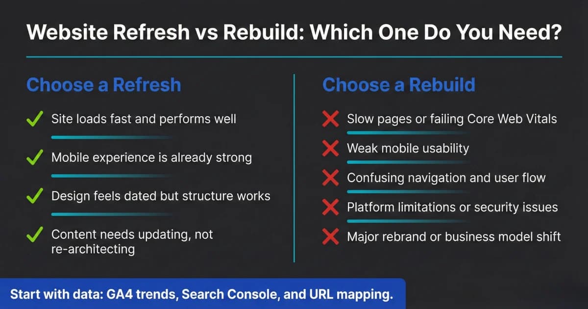
Website Redesign Checklist: Refresh or Rebuild in 2026
Not every website needs a full rebuild. Use this website redesign checklist to decide refresh vs. rebuild, what to prioritize, and how to protect SEO safely.
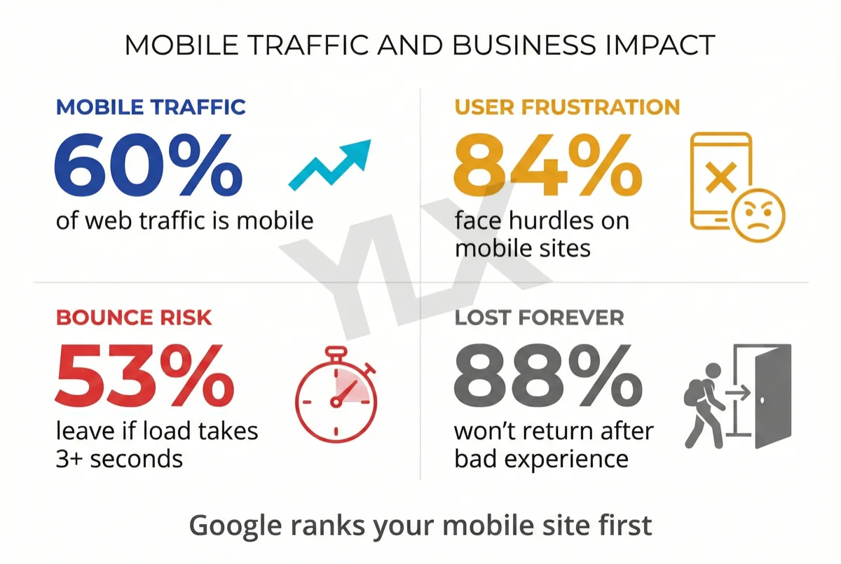
What Is Responsive Design? Why Your Site Must Adapt
Responsive design makes your website work on any screen. With mobile and desktop traffic now close to parity and Google indexing mobile-first, it is a core business requirement.
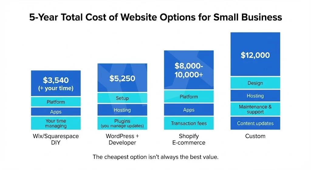
Custom vs Template Websites: What Fits Your Business?
Template or custom? Compare real costs, performance data, and ownership trade-offs so you can choose the website path that fits your business goals today.