What Is Responsive Design? Why Your Site Must Adapt
Pull up your business website on your phone. Does it look good? Can you read the text without zooming? Can you tap the buttons without hitting the wrong one?
If not, you have a problem. And it's costing you customers.
Recent global usage data shows mobile traffic slightly ahead of desktop. Google ranks websites based on their mobile version first. If your site doesn't work well on phones, you're invisible to a large share of your potential customers and penalized by the search engine that sends them to you.
Responsive design fixes this. Let me explain what it is and why it matters for your business.
What Responsive Design Means
Responsive web design is an approach where your website automatically adjusts its layout to fit any screen size. The same website works on a phone, tablet, laptop, and desktop monitor.
No separate "mobile version." No pinching and zooming. The site just adapts.
The term was coined by designer Ethan Marcotte in 2010 (opens in a new tab). Before that, companies built separate mobile websites, often at URLs like m.example.com.
When the iPhone launched in 2007, businesses started requesting device-specific sites. Marcotte's point was that this approach would never scale as new screen sizes kept appearing.
Instead, he combined three existing techniques into one unified approach:
Fluid grids. Instead of fixed pixel widths, layouts use percentages. A sidebar might be 30% of the screen width rather than 300 pixels. When the screen shrinks, the sidebar shrinks proportionally.
Flexible images. Photos and videos scale within their containers. An image that fills half the screen on desktop automatically adjusts to fit a phone screen without overflowing or breaking the layout.
Media queries. These are rules in your website's code that apply different styles based on screen characteristics. "If the screen is narrower than 768 pixels, stack these columns vertically instead of side by side." The browser checks the conditions and applies the right styles automatically.
The result is one website that works everywhere, built and maintained from a single set of files.
Why This Matters Now
Responsive design has been around since 2010. It's not new. But the consequences of ignoring it have never been more severe.
Mobile Traffic Dominates
According to StatCounter Global Stats (opens in a new tab), mobile traffic is currently slightly ahead of desktop globally, with tablet share much smaller. In some regions, mobile share is significantly higher.
The US is an exception where desktop still holds a slight edge at about 50%, but mobile is catching up fast. And for local businesses, the numbers skew even more mobile. People searching "plumber near me" or "restaurant nearby" are almost always on their phones.
This isn't a trend. It's how people use the internet now.
Google Ranks Mobile First
Since July 2024, Google uses mobile-first indexing for 100% of websites. This means Google primarily looks at your mobile site when deciding where you rank in search results.
If your desktop site looks great but your mobile site is broken, Google sees the broken version. Your rankings suffer. The September 2025 core update reinforced this, penalizing sites with poor mobile performance metrics.
This ties directly into Core Web Vitals. If your mobile site loads slowly (taking more than 2.5 seconds to show content) or jumps around while loading, Google notices and ranks you lower.
Users Leave Frustrated Sites
The business impact goes beyond rankings. Mobile users are typically less tolerant of friction and slower page experiences.
One benchmark is still clear: 53% of mobile visitors leave (opens in a new tab) when a page takes longer than 3 seconds to load.
If someone visits your site on their phone, struggles to navigate, and leaves, they're not coming back. They're going to your competitor who figured this out.
Mobile web statistics: 60% of traffic is mobile, 84% of users face mobile hurdles, 88% won't return after bad experience, 53% leave if load takes over 3 seconds
The Business Case
Responsive design isn't just about avoiding problems. It drives measurable results.
Conversion Rates
According to VWO's web design statistics (opens in a new tab), responsive websites see 11% higher conversion rates compared to non-responsive sites. Mobile-friendly sites convert 40% better than non-optimized ones.
One case study stands out. Skinny Ties, a men's accessories retailer, implemented responsive design and saw:
- 13% overall conversion growth
- 71% conversion growth on iPhone specifically
- 42% revenue growth across all devices
- 377% revenue increase from iPhone users
That's not a marginal improvement. That's transformative.
Trust and Credibility
According to Hostinger's web design research (opens in a new tab), 75% of users judge a business's credibility based on its website design. A site that looks broken on mobile signals that maybe the business itself isn't professional or current.
Conversely, 88% of users with a positive browsing experience are more likely to return. Responsive design creates that positive experience across all devices.
How Responsive Design Works
You don't need to understand the technical details to make good decisions, but knowing the basics helps when talking to developers or evaluating your current site.
The Viewport Meta Tag
Every responsive website needs a specific instruction in its code that tells mobile browsers how to handle page width.
Without it, mobile browsers render pages at desktop width and shrink everything to fit. Text becomes unreadable, buttons become untappable, and responsive rules don't kick in.
Your developer adds this instruction once, and it tells the browser to set the page width to match the device width and start at normal zoom. It's the foundation that makes everything else possible.
Breakpoints
Responsive designs use breakpoints, which are screen widths where the layout changes. Common breakpoints include:
| Screen Width | Typical Devices |
|---|---|
| Under 480px | Phones |
| 481px - 768px | Large phones, small tablets |
| 769px - 1024px | Tablets, small laptops |
| 1025px - 1200px | Laptops |
| Over 1200px | Desktops, large monitors |
At each breakpoint, the design might shift. A three-column layout on desktop becomes a single column on mobile. Navigation may move from a horizontal menu to a collapsed menu.
Images resize. Font sizes adjust.
The best approach is to set breakpoints where your content needs them, not where specific devices happen to be. Design for when the layout starts to look cramped or awkward, not for the iPhone 15 specifically.
Responsive design demonstration: the same website layout adapting fluidly from mobile phone to tablet to laptop to desktop monitor
Mobile-First Design
Modern practice is to design for mobile first, then add complexity for larger screens. This forces you to prioritize what matters on small screens first.
Start there, then progressively enhance for tablets and desktops.
This approach tends to produce faster, cleaner websites because you're not starting with desktop complexity and trying to strip it down.
Responsive vs Adaptive vs Separate Mobile Sites
You might encounter these alternatives. Here's how they compare.
Adaptive design creates multiple fixed layouts for specific screen sizes (typically 320, 480, 760, 960, 1200, and 1600 pixels). Instead of fluidly resizing, the site detects your screen and serves the closest matching layout. It can be faster because layouts are pre-optimized, but it's more work to build and may not look perfect on screens between the fixed sizes.
Separate mobile sites (m.example.com) were common before responsive design. You maintain two separate websites, which doubles maintenance and introduces redirect complexity.
Google explicitly recommends responsive design in its mobile-first indexing documentation (opens in a new tab). Separate mobile sites are still possible, but usually harder to maintain well.
Common Mistakes to Avoid
If you're building a new site or evaluating your current one, watch for these problems.
Designing desktop-first. Start with mobile. It's harder to squeeze a complex desktop layout onto a phone than to expand a simple mobile layout for desktop.
Using fixed pixel sizes. If a button is exactly 200 pixels wide, it might overflow on a 320-pixel phone screen. Use relative units (percentages, em, rem) that scale with the screen.
Tiny touch targets. Fingers are bigger than mouse cursors. Buttons and links need to be at least 48×48 pixels for comfortable tapping. Anything smaller leads to misclicks and frustration.
Not optimizing images. A 2MB hero image that looks great on desktop will crawl on a mobile connection. Serve appropriately sized images for each device. Our guide to optimizing website images with WebP covers how to serve the right format and size.
Hiding content instead of removing it. Some developers make desktop elements invisible on mobile rather than actually removing them.
The problem is that hidden content may still load in the background. If mobile users don't need it, don't load it at all.
Only testing in browser tools. Chrome's device emulator is useful but doesn't catch everything. Touch behavior, actual network speeds, and real device quirks require testing on actual phones and tablets.
How to Test Your Site
Check whether your site is responsive:
Visual inspection. Open your website on your phone.
Can you read everything without zooming? Do buttons work with your thumb? Does the layout look intentional, not broken?
Google's Lighthouse. Review the PageSpeed Insights documentation (opens in a new tab), then run your site on pagespeed.web.dev. It tests mobile performance and flags issues like text that's too small or touch targets that are too close together.
Resize your browser. On desktop, slowly drag your browser window narrower and watch what happens.
Does the layout adjust smoothly? Do elements overlap or overflow? Where does it break?
Testing tools. Sites like Responsive Design Checker (opens in a new tab) show how your site looks across different device sizes. BrowserStack (opens in a new tab) offers testing on thousands of real devices.
If you find problems, you'll need a developer to fix them. Or, if your site is built on an older platform that doesn't support responsive design well, it might be time for a rebuild. Our website redesign checklist can help you figure out whether you need a quick refresh or a full rebuild.
What We Build
Every website we create is responsive from the start. We don't build a desktop site and then try to make it work on mobile.
Our process starts mobile-first. We design for the smallest screens first, focusing on what matters most. Then we progressively enhance for larger screens, adding complexity only where it adds value.
We test on real devices, not just browser emulators. We optimize images so they load fast on mobile connections. We make sure touch targets are appropriately sized. We check Core Web Vitals on mobile specifically, because that's what Google cares about.
The result is sites that score 90+ on mobile PageSpeed tests and pass 100% of Core Web Vitals. Not because we optimize after the fact, but because responsive, fast mobile performance is built into how we work.
The Bottom Line
Responsive design means your website works on any screen. It's not a nice-to-have. With mobile traffic now slightly ahead globally and Google ranking based on your mobile site, it's a requirement.
The consequences of getting this wrong are real:
- Lower search rankings because Google sees a broken mobile experience
- Lost customers who leave when they can't navigate on their phones
- Damaged credibility from a site that looks unprofessional on mobile
- Lower conversions because frustrated users don't buy
The fix is straightforward. Build (or rebuild) your site with responsive design from the ground up.
Test on real devices. Optimize for mobile speed. Make sure everything works with a thumb tap.
If your current site doesn't resize properly on mobile, you're losing business every day it stays that way.
Not Sure If Your Site Is Responsive?
If you're not certain how your website performs on mobile, we can take a look. We'll test it across devices, check your Core Web Vitals, and explain what we find in plain terms.
Get a free mobile performance review: Contact us at info@ylx.ca
Analysis FAQ.
What is responsive web design?
Responsive web design is an approach where your website automatically adjusts its layout to fit any screen size. The same website works on phones, tablets, laptops, and desktops. It uses fluid grids, flexible images, and media queries to adapt layouts based on screen characteristics.
Why is responsive design important for SEO?
Google uses mobile-first indexing, meaning it primarily looks at your mobile site when deciding rankings. Since July 2024, this applies to 100% of websites. If your mobile site is broken, Google sees the broken version and your rankings suffer.
What percentage of web traffic is mobile?
Recent StatCounter Global Stats data shows mobile at about 50.59% of global web traffic in January 2026, with desktop close behind at 48.05%. In many local intent searches, mobile behavior is still especially strong because people often search from their phones.
How do I test if my website is responsive?
Test your site on actual phones and tablets, not just browser resize. You can also use Google's Mobile-Friendly Test tool or check Core Web Vitals in Google Search Console. Look for text that requires zooming, buttons too close together, or horizontal scrolling.
Tagged with

Further Reading
Related Analysis.
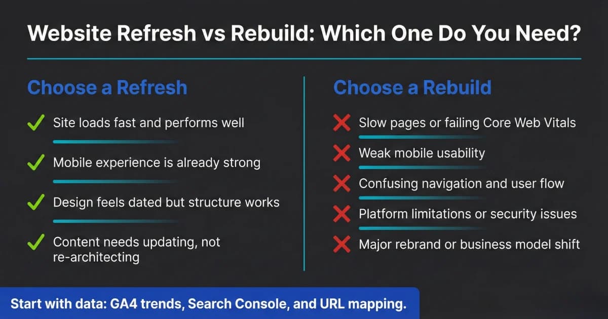
Website Redesign Checklist: Refresh or Rebuild in 2026
Not every website needs a full rebuild. Use this website redesign checklist to decide refresh vs. rebuild, what to prioritize, and how to protect SEO safely.
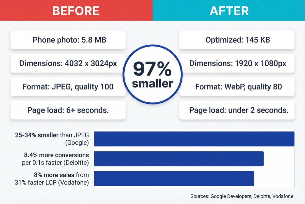
How to Optimize Your Website Images With WebP (2026)
Your website images are probably too large. Learn how to convert to WebP, resize for the web, and serve fast-loading images without visible quality loss.
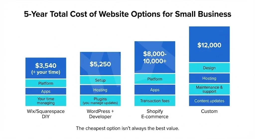
Custom vs Template Websites: What Fits Your Business?
Template or custom? Compare real costs, performance data, and ownership trade-offs so you can choose the website path that fits your business goals today.