Accessible Contact Forms: Build Pages That Work for Everyone
Your contact form is probably the most important page on your website. It's where visitors become leads. But if that form doesn't work for someone using a screen reader, navigating by keyboard, or dealing with a motor impairment, you've lost them.
This isn't niche traffic. In the federal government's 2025 regulatory analysis for digital accessibility rules, about 45% of Canadians with disabilities reported a digital technology-related barrier (opens in a new tab) when interacting with a federal sector organization or business. That number is broader than forms specifically, but it shows how common digital friction is.
Accessible web forms aren't just about compliance. They're about making sure the form you spent time and money building actually works for the people trying to use it.
The Problem Is Bigger Than You Think
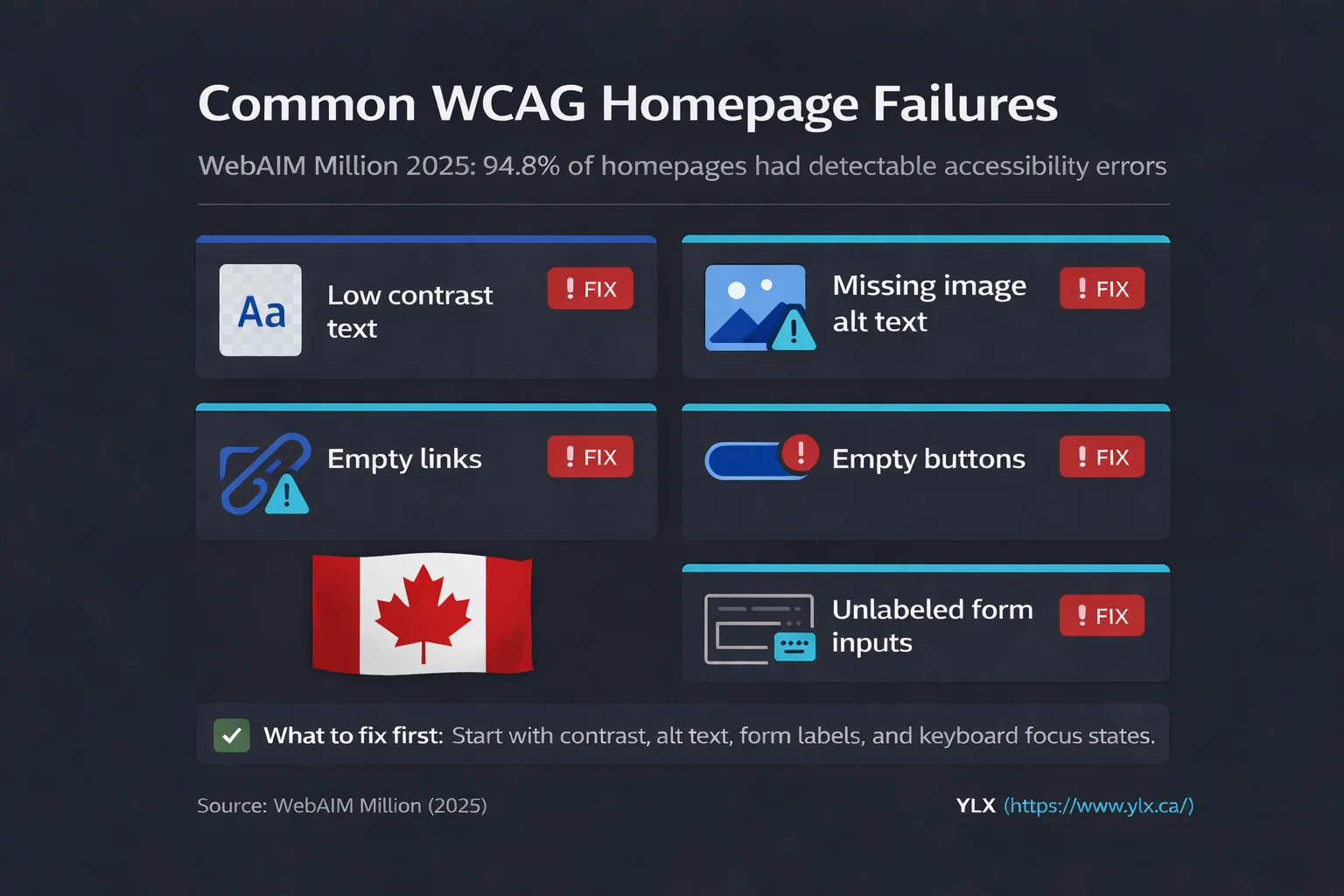
WebAIM's 2025 analysis of the top one million websites (opens in a new tab) found that 48.2% of home pages had at least one missing form input label. Of all individual form inputs across those pages, 34.2% were not properly labeled. Nearly 30% of pages had empty buttons with no discernible text.
These are the most basic form accessibility requirements. Labels. Buttons with names. And almost half the web gets them wrong.
Missing labels are the third most common accessibility failure on the web, behind only low-contrast text and missing image alt text. They've sat in that same spot for all seven years WebAIM has run the study.
What this means for you: if your contact form was built from a template or a page builder, there's a good chance it has at least one of these issues. Most form builders prioritize how the form looks, not how it works for people using assistive technology.
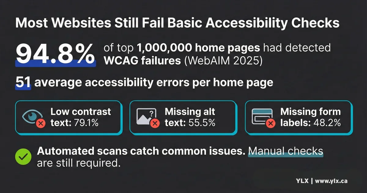
Web accessibility statistics from WebAIM 2025 showing 48.2% of home pages with missing form input labels, 34.2% of form inputs not properly labeled, and 29.6% of pages with empty buttons.
What "Accessible" Means for Forms
The Web Content Accessibility Guidelines (WCAG) (opens in a new tab) define specific requirements for forms. We cover WCAG broadly in our guide to what WCAG is and how it applies to your business. Here, I'll focus on the rules that directly affect forms.
1. Every field needs a label
This is the foundation. WCAG Success Criterion 3.3.2 (Labels or Instructions) (opens in a new tab) requires that every form field has a label or instruction telling users what to enter.
The label must be programmatically linked to the field, not just visually placed near it. A screen reader doesn't know that the word "Email" sits above an input field unless the code explicitly connects them with a <label> element.
The W3C WAI Forms Tutorial on labeling (opens in a new tab) recommends the explicit <label> element with matching for and id attributes as the primary approach. Deque's first rule of ARIA (opens in a new tab) says the same thing: use native HTML before reaching for ARIA attributes.
Placeholder text is not a label. The W3C WAI Forms Tutorial on instructions (opens in a new tab) warns that placeholder text disappears when the user starts typing, and screen readers do not treat it as a label. If your form uses placeholder text instead of visible labels, screen reader users may have no way to know what a field expects.
2. Errors must be identified and described
When someone submits a form with mistakes, two things need to happen. First, the field with the error must be clearly identified. Second, the error must be described in text. WCAG 3.3.1 (Error Identification) (opens in a new tab) covers the first part, and 3.3.3 (Error Suggestion) (opens in a new tab) covers the second.
Color alone isn't enough. If you turn a field border red but don't add a text message, someone who is colour-blind may never notice the error.
WebAIM's form validation guide (opens in a new tab) recommends combining an error summary at the top of the form with inline error messages next to each invalid field. The summary should include links that jump directly to the problem fields. Each field should be marked with aria-invalid="true" and have its error message connected through aria-describedby.
3. Forms must work with a keyboard
Some people can't use a mouse. WCAG 2.1.1 (Keyboard) (opens in a new tab) requires that all form functionality works through a keyboard alone. That means users need to be able to Tab between fields, activate buttons with Enter or Space, and see a visible indicator showing which field is currently focused.
Suppressing the browser's default focus outline with CSS (outline: none) without providing a replacement breaks WCAG 2.4.7 (Focus Visible) (opens in a new tab). Every interactive element in your form must show a clear visual indicator when it receives keyboard focus.
4. Related fields should be grouped
When you have a set of radio buttons or checkboxes, the individual labels ("Yes," "No") don't make sense on their own. They need context from the group heading ("Do you have an existing website?").
WCAG 1.3.1 (Info and Relationships) (opens in a new tab) requires that these relationships be expressed in code. The standard pattern uses <fieldset> and <legend> elements. The W3C WAI tutorial on grouping (opens in a new tab) explains that without this grouping, screen reader users must navigate each control individually and guess what the group is asking.
5. Fields collecting personal info need autocomplete
This one catches most people off guard. WCAG 1.3.5 (Identify Input Purpose) (opens in a new tab), introduced in WCAG 2.1, requires that form fields collecting personal information use the HTML autocomplete attribute (opens in a new tab) with the correct value.
A name field should have autocomplete="name". An email field should have autocomplete="email". A phone field should have autocomplete="tel".
This does more than enable autofill. For people with motor disabilities, it reduces the amount of typing required. For people with cognitive disabilities, assistive technology can use the autocomplete values to display familiar icons next to fields, like a phone icon next to a telephone number field.
Using an incorrect autocomplete value is an explicit WCAG failure (F107) (opens in a new tab).
Annotated accessible contact form diagram showing linked labels, autocomplete tokens, grouped options with fieldset and legend, visible focus states, error summary with inline errors, and aria-invalid plus aria-describedby associations.
How Screen Readers Actually Use Forms
Understanding how screen readers work with forms explains why these rules matter.
Screen readers have two main modes. Browse mode lets users read through a page from top to bottom using arrow keys. Focus mode (called "forms mode" in JAWS) activates when the user tabs to a form control. In focus mode, the screen reader only announces information directly associated with the focused element: its label, its role ("text field," "checkbox"), its state ("required," "invalid"), and any description linked through aria-describedby.
Here's the important part: text that sits between form controls but isn't programmatically linked to them is invisible in focus mode. If your form has a help message between two fields but that message isn't connected to either field through aria-describedby, screen reader users in focus mode will never hear it. The W3C WAI tutorial on form instructions (opens in a new tab) specifically warns about this.
WebAIM's 2024 screen reader survey (opens in a new tab) found that experienced screen reader users are more than twice as likely to jump directly to form fields rather than reading through the entire page. These users skip straight to the form. If the form's labels and descriptions aren't properly coded, they get no context at all.
The same survey found that complex forms rank among the top accessibility barriers reported by screen reader users (opens in a new tab), alongside CAPTCHAs and unexpected page changes.
What to Ask Your Web Developer
If you're not building forms yourself, you still need to know whether your forms are accessible. Here are specific questions to ask your developer or web provider:
About labels:
- Does every form field have a
<label>element linked to it? - Are labels visible on screen, not just hidden with ARIA?
- Are radio and checkbox groups wrapped in
<fieldset>with a<legend>?
About errors:
- When a form submission fails, does the error message appear in text (not just a color change)?
- Is each error message linked to its field using
aria-describedby? - Does focus move to the error summary or the first invalid field?
About keyboard access:
- Can someone complete the entire form using only Tab, Enter, and Space?
- Is there a visible focus indicator on every field and button?
About autocomplete:
- Do name, email, phone, and address fields have the correct
autocompleteattributes?
About mobile:
- Are form fields and buttons at least 24x24 CSS pixels? (WCAG 2.5.8 (opens in a new tab) sets this as the minimum target size.)
- Do email fields show an email keyboard on mobile? Do phone fields show a number pad?
If your developer can't answer these questions, that's a sign the forms may not have been built with accessibility in mind.
Side-by-side comparison of inaccessible versus accessible forms showing placeholder-only fields versus visible labels, color-only errors versus text suggestions, mouse-only controls versus keyboard support, missing focus states, ungrouped radio inputs, and missing versus correct autocomplete tokens.
The Legal Side (For Ontario Businesses)
If you run a business in Ontario with 50 or more employees, your website must meet WCAG 2.0 Level AA. Ontario's website accessibility guidance (opens in a new tab) states this requirement for businesses and non-profits with 50+ employees, and the legal requirement is set in O. Reg. 191/11, Section 14 (opens in a new tab). That includes form accessibility. We cover AODA requirements in detail in our guide to AODA website accessibility for Ontario businesses.
The requirement has been in effect since January 1, 2021 for large organizations. Corporations face fines of up to $100,000 per day under Section 37 of the AODA (opens in a new tab). In 2024, the Ontario government completed 871 verification audits and issued 19 Director's Orders (opens in a new tab).
At the federal level, the Accessible Canada Act's Digital Technologies Phase 1 regulations (opens in a new tab) were published in December 2025. These adopt the CAN/ASC - EN 301 549 standard (opens in a new tab), which includes WCAG 2.1 Level AA requirements. Federal public sector organizations must comply by December 5, 2027, with large federally regulated private-sector entities following by December 5, 2028.
Manitoba's accessibility law now requires WCAG 2.1 Level AA for all businesses (opens in a new tab) with one or more employees as of May 1, 2025.
This is educational information, not legal advice. For legal interpretation specific to your organization, consult qualified counsel.
A Quick Test You Can Run Right Now
You don't need special tools to check the basics. Open your contact page and try these:
1. The keyboard test
Put your mouse aside. Press Tab to move through the form. Can you reach every field and the submit button? Can you see which field is focused? Can you select options in dropdowns using arrow keys? If you get stuck anywhere, your form has a keyboard accessibility problem.
2. The label test
Click on the text label next to a form field. If clicking the label puts your cursor in the field, the label is properly connected. If nothing happens, the label is visual only and not programmatically linked. Repeat for every field.
3. The error test
Submit the form with empty required fields. Does the error message explain what went wrong in text? Does it tell you which field needs fixing? Or do you just see a red border with no explanation?
4. The zoom test
Zoom your browser to 200% (Ctrl+Plus or Cmd+Plus). Is the form still usable? Can you see all fields and labels without horizontal scrolling?
For a more thorough review, our guide to how to test your website for accessibility with free tools walks through automated scanners like WAVE and Lighthouse that can catch form issues.
What We Do at YLX
Every contact form and lead capture form we build follows these practices. Labels are linked. Errors are described in text. Keyboard navigation works. Autocomplete attributes are set. Focus indicators are visible.
We also test forms with screen readers during development, not after. It's much cheaper to build accessibility in from the start than to retrofit it after launch.
When we audit a client's existing site, form accessibility is one of the first things we check. Missing labels and broken keyboard navigation are among the fastest wins because they're relatively simple to fix and they affect every visitor who uses the form.
The Bottom Line
Accessible forms aren't complicated. They require attention to a few specific practices: visible linked labels, descriptive error messages, keyboard operability, autocomplete attributes, and grouped related fields. Most of the work is getting the HTML right.
The payoff is a form that works for more real visitors, including people who use screen readers and keyboard navigation, plus search engines that reward properly structured content.
If your form can't be completed with a keyboard, or if a screen reader can't identify what each field expects, you're turning away customers who wanted to reach you.
Need Help With Your Forms?
If you're not sure whether your contact forms are accessible, we can take a look. We'll test your forms with screen readers and keyboard navigation, check for WCAG compliance, and explain what we find in plain terms.
Get a free form accessibility review: Contact us at info@ylx.ca
Analysis FAQ.
What makes a web form accessible?
An accessible web form has visible labels linked to every input field, clear error messages that identify what went wrong and how to fix it, full keyboard navigation support, proper use of the autocomplete attribute, and logical grouping of related fields with fieldset and legend elements.
Do I need accessible forms for AODA compliance?
If your Ontario organization has 50 or more employees, AODA requires your website to meet WCAG 2.0 Level AA. That includes form accessibility requirements like labeled inputs, error identification, error suggestions, and keyboard operability. The next compliance reporting deadline is December 31, 2026.
Can I use placeholder text instead of labels?
No. Placeholder text disappears when someone starts typing, leaving users with no reference for what the field expects. Screen readers do not treat placeholder text as labels. Always use a visible label element associated with each form field.
What is the autocomplete attribute and why does it matter?
The autocomplete attribute tells browsers what type of information a field collects, like name, email, or phone number. It enables autofill, reduces typing for users with motor disabilities, and helps screen readers communicate field purpose. WCAG 2.1 Level AA requires it on fields collecting personal information.
Tagged with

Further Reading
Related Analysis.
AODA Website Accessibility Rules for Ontario Businesses
Ontario's AODA sets accessibility rules by organization size. Learn who needs WCAG 2.0 AA websites, who files reports, and the key 2026 filing deadlines.
How to Test Your Website for Accessibility (Free Tools)
Most websites fail accessibility checks. Use these free tools and manual tests to find high-impact issues, prioritize fixes, and improve your site's usability.
What Is WCAG? Web Accessibility Explained for Business
WCAG defines how to build websites everyone can use. Millions of people need accessible design to use the web. Here is what that means for your business.